Website Redesign

🕰️ Context
Like other programmers with some experience in website development, I have toyed around with the design of my website over time. My first website was on WordPress before I learned to code, the second was built using a React template, and the third was a Hugo-based website using HugoBlox. The transition between the second and third website was motivated by the tech debt of the old React template I used as well as a desire to have a simple website that supported me during my Master’s degree with features for my research publications. The website was always planned as a temporary solution until such time as I could focus on redesigning from the ground up.
⚒️ My Design Process
My design process had six steps:
- Design Search
- Condense Learnings
- Determine My Content (data)
- Data-informed Design
- Coding
- User Testing (+ repeat steps as needed)
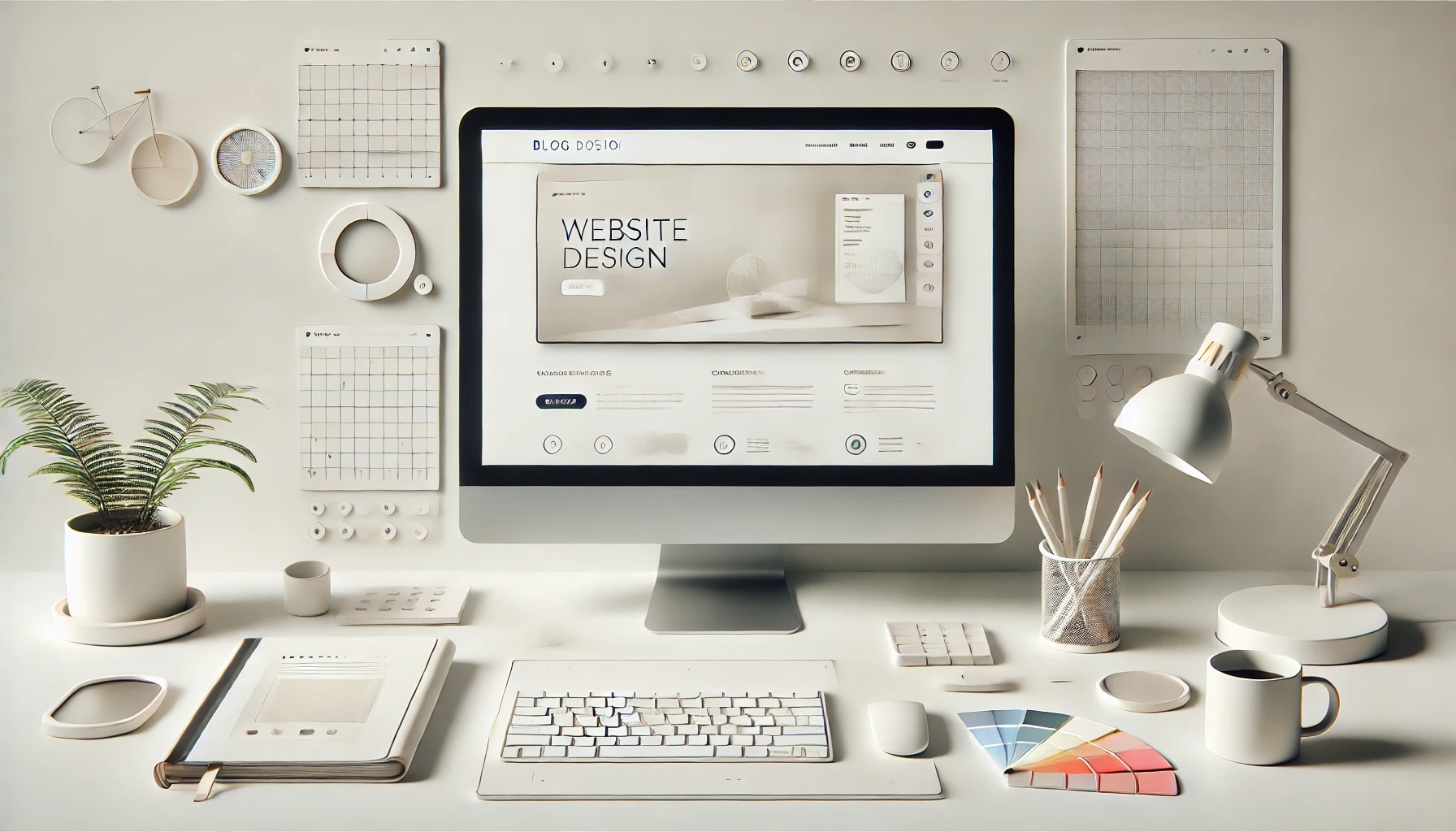
In the following section, I detail steps 1 and 2. When reviewing my content, I realized (1) I have limited required copy and content that the user needs to see (mostly my work experience, published work, and projects) and (2) I wanted to support my writing with academic-style citations. After searching, I decided to separate my writing into its own website using the Quarto framework (“Quarto” 2024). This separation provides for easier writing, but importantly it allows me to refactor my base website without worrying about backwards compatibility for my writing. Quarto is quite expressive and customizable for a markdown-native framework which has allowed me to add a number of extra features to this website including a reference backrefs, styled progress bar, view counters, and use of the view transitions API 1.
🪞 Web Design Learnings
Successful Examples Categorized
These websites may be redesigned by the time you are reading this.
Committing to an aesthetic
Examples include:
- Minimal (mostly dark)
- 3D with three.js
- itssharl.ee – brilliant use of animations and using the same 3D shapes on hover animations for desktop
- bruno-simon.com – cool factor achieved
- jesse-zhou.com – extremely detailed design
- edwardh.io – fun integration of 3D in a normal portfolio website
- Bright and Curvy
- Gallery (lots of pictures)
- Other Aesthetic Examples
- Coder
- 8-bit
- thegeekdesigner.com – great copy as well as brilliantly designed
- expensive.toys – a fun 404 page
Animations & Interaction
Examples include:
- Loading animation
- Scroll animation
- Cursor following animations, clickable items, etc.
- minhpham.design/ – hilarious hidden copy on hover
My Key Design Considerations
- Wow Factor: This is one of those you know it when you see it traits. Having reflected on all the websites above and many more, I believe that the Wow Factor is based on (1) Animations / Interactivity and (2) Design Cohesion. Cohesion for some designs is relatively easy, e.g. a minimalistic design is naturally cohesive due to the relatively few design elements being implemented. Ultimately, cohesion also depends on decisions about Typography, Colors, and Animations.
- Reducing Cognitive Load: Some websites are awe-inspiring but make it hard to get to the raw data or have scrolling animations that make my fingers hurt due to the amount of time it takes to traverse the page. A brilliant example of a low-cognitive-load website that is also impressive is gkoberger.com which uses clickable objects in the hero div and related animations to present a simple, yet information-dense website. This website served as a key inspiration for my design.
- Who is the Audience: Many excellent websites struggle to deliver a similar experience on mobile devices. There are inherent limitations of mobile but at a minimum, the same information should be accessible to the user. This is just one example of having to develop for different audiences who either are viewing the website differently or looking for different information from the website.
The tension between generating a Wow Factor while having a low User Cognitive Load and serving the different audiences viewing my website makes the design process challenging.
My objectives to balance these considerations were:
- Commit to a unique aesthetic for my website, e.g. making it look like a Google/Apple Maps page.
- Ensure all high-priority information is accessible within 5 seconds of loading the website (ideally all the information is within the first page on desktop) - Subgoal: Be information efficient: tighten up copy, provide smaller bites of information with clickable elements for users to learn more when interested, and use visuals to display information when possible.
- Implement animations for Loading, Hovers, Clicking into sections, and (if applicable) Scrolling. Consider opportunities for interactivity.
- Ensure all information is accessible on mobile and consider how to make mobile viewing equally enjoyable as desktop viewing.
✔️ Results
View my website at kasralekan.com.
References
Footnotes
This implementation of view transitions has been quite hacky and required much more refinement than anticipated due to the way Quarto injects content or executes JS based on the header yml elements in the different page files.↩︎